FORMAT
VISUAL DESIGN
Visual design is covered in professional journals and the field of graphic design. It is also worthy of study in multiple classes like technical writing and business writing. This page only introduces the basic visual elements, These elements are presented in textbooks and several online sites. As you work with visual design, be aware of how you should use these terms in your analysis and critiques:
Visual Elements
Online resource at http://desktoppub.about.com/cs/graphicdesign/a/designbasics_2.htm
Principles of Design
Definitions and some lessons online at http://desktoppub.about.com/cs/graphicdesign/a/designbasics_3.htm and helpful illustrated examples online at http://desktoppub.about.com/od/designprinciples/l/aa_pod2.htm
Ethical Concerns
Page Design Considerations: Headings
Visual design is covered in professional journals and the field of graphic design. It is also worthy of study in multiple classes like technical writing and business writing. This page only introduces the basic visual elements, These elements are presented in textbooks and several online sites. As you work with visual design, be aware of how you should use these terms in your analysis and critiques:
Visual Elements
Online resource at http://desktoppub.about.com/cs/graphicdesign/a/designbasics_2.htm
- lines
- shapes
- mass
- texture
- color
Principles of Design
Definitions and some lessons online at http://desktoppub.about.com/cs/graphicdesign/a/designbasics_3.htm and helpful illustrated examples online at http://desktoppub.about.com/od/designprinciples/l/aa_pod2.htm
- alignment: order, grouping, visual connections
- balance: symmetry, radial, rule of thirds, focus, and grids
- contrast: with size, value, color, and type
- proximity and unity: grouping related items so they are viewed as one thing, used to indicate relationships, organization, and page content.
- repetition and consistency: help readers navigate a document or provide strong emphasis
- white space: not always white but always helpful in making documents readable; use text-chunking with headings as one methods for creating white space
Ethical Concerns
- Avoid copyright infringement; do not risk subjecting your company or yourself to a lawsuit.
- Graphs and charts must present the parts in their honest relationship to each other.
- The source for data used in graphs and charts must be documented.
- Pictures and drawings should not be exaggerated or make false implications.
- Writers face conflicts of interest when their job requires them to "bury" information in small print, all caps, or a too-busy design in order to claim that they presented the information but so that the audience will be unlikely to actually read it. Technical communicators should be reader advocates and protect readers from unethical designs. Use the ethics code of the Society of Technical Communicators or some other professional organization to help you fight such on-the-job conflicts.
Page Design Considerations: Headings
- For most documents, avoid templates because they are usually badly designed.
- If the assignment instructions call for following APA guidelines, see these two resources for details: Rodgers Tips or Purdue OWL
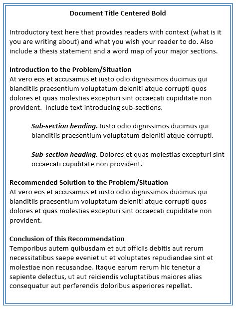
- The document title is the only heading that should not have text introducing the heading. Text should precede all headings and introduce the sections to come. Never put two headings in a row with no text separating them.
- When following APA guidelines, heading will be black font on white background unless the writer had a good reason to use color. Many professional publications print only black on white, so color will turn into some shade of grey.
Page Design Considerations: Visuals
- Introduce relevant visuals in the text before the visual and put visuals that merely elaborate in an appendix.
- Before or after the visual, explain it. Do not rely on the visual's content to be self-explanatory. Readers do not want to work that hard and consider it your job to explain what it means and why you put it in the document.
- Make sure all the elements in the visual are legible and clear.
- In reports and many other document types, label visuals. A default labeling method includes the caption term Table for tables and Figure for graphs, charts, pictures, and photographs, and Equation for mathematics equations. The caption should be followed by a number. Put table and equation captions above the visual and figure captions below the visual (Remember: Table Top!). Other labeling elements include a title (using upper and lower case lettering) and a Note. in which the source for data should be included. For additional APA formatting requirements for visuals see my handout online at http://tips.rhettime.net/apa-visuals.html
Use the Right Visual for the Job
Consider the situations in the Visuals Quiz chart, right column, and fill in the blank with a choice from the illustrations in theeft column.
To check your responses , swipe your cursor over the white space below this line.
Q1 Representation of objects = B. Drawing
Q2 Large amounts of data = F. Table
Q3 Stages of a process = D. Flow chart
Q4 Relative values = A. Bar graph
Q5 Changes over time = C. Line graph
Q6 Parts of a whole = E. Pie chart
Q1 Representation of objects = B. Drawing
Q2 Large amounts of data = F. Table
Q3 Stages of a process = D. Flow chart
Q4 Relative values = A. Bar graph
Q5 Changes over time = C. Line graph
Q6 Parts of a whole = E. Pie chart
For Discussion

What is wrong with having two headings in a row with no text between the headings? What is wrong with putting an Introduction heading after the document title?
Why is APA style always black and white? Color can aid navigation in a complex table, so why not use color in tables?
Copyright 2012-2015
Ida L. Rodgers, See terms on Course Style Guide Home page.
